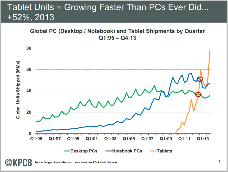
The news is not a big shocker, considering the massive acceptance rate and growth the mobile market has seen in the last few years.
According to Kleiner Perkins Caufield & Byers (KPCB) Internet Trends 2014, the market has evolved beyond earlier expectations.
With a market that is still growing, it makes sense for Google to take stock and ensure that their user base is getting the best possible experience across their device.
In other words, why serve a website designed for a PC which was designed back in 1999, when it can’t possibly provide the same type of experience as a mobile responsive design.
These new signals should directly affect over half of the totals SERP results meaning this will be one of the biggest updates in a long time.
To put this into perspective, usually a global update affects between .1% – 10% of global search results with the higher end of the spectrum usually only happening when something goes wrong at Google (example: when gmail goes down). If you have ever wondered where to find this data, I would start here: https://www.google.com/appsstatus#hl=en&v=status&ts=1422334799000 and view the associated documents.
If you NEED to know as it happens, consider using their RSS feed: https://www.google.com/appsstatus/rss/en
The signs have been on the wall for a while, however with inconsistent mobile frameworks and beta / buggy releases with infrequent updates, it’s only recently that standardization and best practices have been established enough that Google could confidently make assumptions to base their algorithm updates on.
What does this mean for everyone? In theory, better results and a better experience.
What does this mean for online marketers? Get with the times or get lost in a sea of higher relevant “viewport” relevant results.


